A working reference for setting type on the web
Typography Handbook.
Concise, practical, and current. Hierarchy, rhythm, measure, font loading, fluid scales, OpenType, dark mode — and the CSS that makes each of them work.
Contents
01
Introduction
What is typography? #
Typography is more than just what fonts you use. It is everything that has to do with how text looks – font size, line length, colour, and subtler things like the whitespace around a text. Good typography sets the tone of your written message and helps reinforce its meaning and context.
This handbook is based on Kenneth Wang’s original Typography Handbook, updated and restyled as an independent reference. It is meant to be short and concise – a quick reference rather than an in-depth guide. For deeper explanations, follow the Further Reading links in each section.
02
Typographic Design
Visual hierarchy #
Visual hierarchy is the concept of organising elements on a page in a way that establishes an order of importance, allowing readers to easily navigate the page and find relevant content. When done correctly, it should guide the reader’s eye throughout different sections of the page. Visual hierarchy is very prevalent in typography, and forms the basis of typographic design theory.
Consider the following typographic design of Alice’s Adventures In Wonderland, which clearly establishes a visual hierarchy:
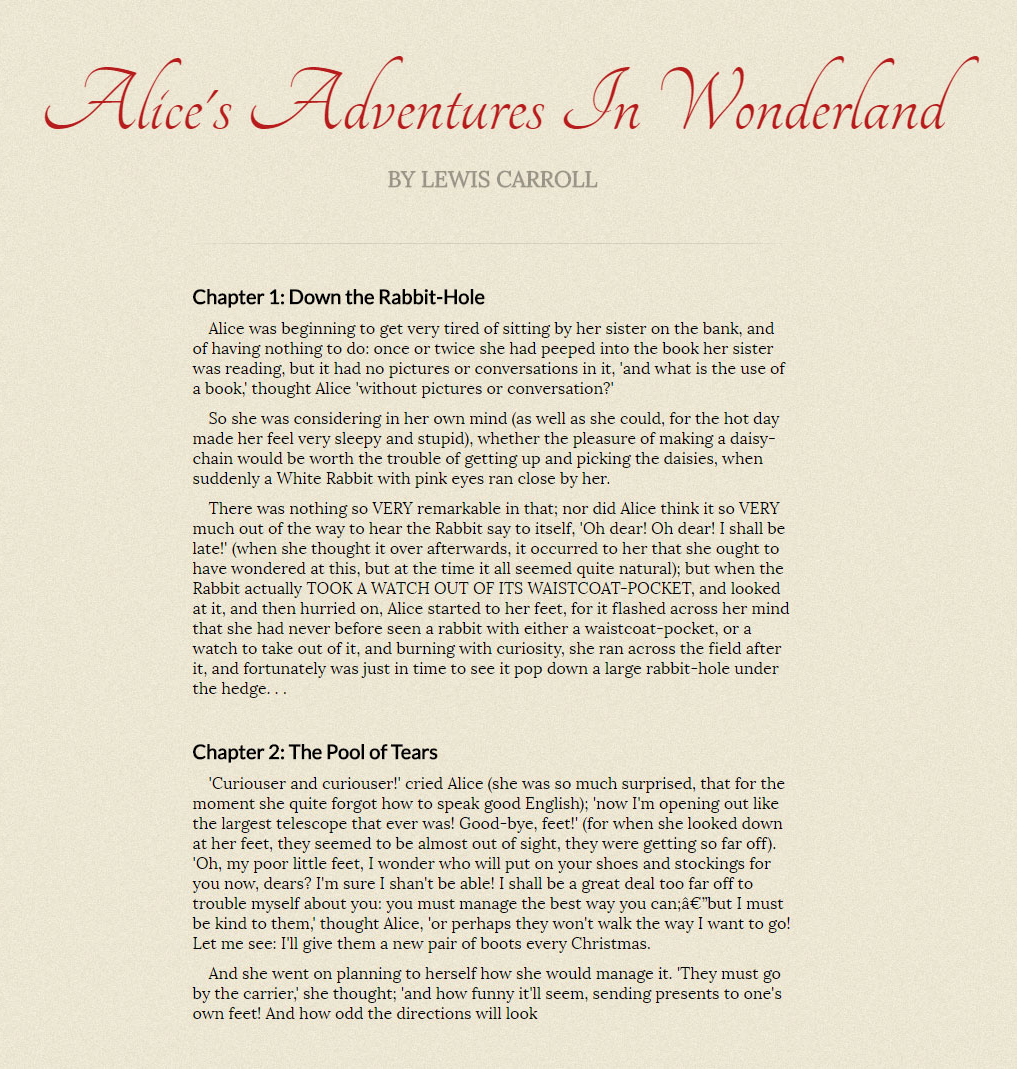
Visual hierarchy can be broken down into four parts:
- Size & Weight: Size and weight are the two easiest ways to create visual hierarchy. They easily indicate what is important, and readers' eyes naturally jump to them.
- Positioning: The title and author sitting above the rest of the text and centred shows its importance.
- Typeface: Contrasting typefaces can create a distinction between different elements and achieve visual hierarchy.
- Colour: Setting important text in a different colour is a very easy way to create visual hierarchy. However, only do so sparingly as using colour everywhere causes it to lose its distinction.
Further Reading
- Visual Hierarchy: How Well Does Your Design Communicate?
- Creating Exciting And Unusual Visual Hierarchies
Gestalt laws in typography #
Gestalt principles, or gestalt laws, are rules of the organization of perceptual scenes. When we look at the world, we usually perceive complex scenes composed of many groups of objects on some background, with the objects themselves consisting of parts, which may be composed of smaller parts, etc. Scholarpedia
The two most important Gestalt Laws to understand in typography are the Law of Proximity and the Law of Similarity.
Law of proximity
The Law of Proximity states that humans perceive objects that are closer together as related objects, and vice versa. In typographic design, “proximity” refers to the amount of whitespace created by line height, margin, and padding. There should be a distinctive and noticeable amount of additional whitespace between two different sections.
Law of similarity
The Gestalt Law of Similarity states that entities that look similar tend to be grouped together. In typography, this means keeping your styles consistent on elements that serve the same function. Elements with different functions should not look similar to one another.
Further Reading
03
Fonts
Choosing fonts #
Choosing fonts is a creative and emotional process. Different fonts convey different feelings, and you want a font that complements the tone of your text.
- Start by finding a good font for your body text. When combining multiple fonts, keep your body font constant, and try to find other fonts that go well with it.
- Get inspired by others. Fonts In Use features a large collection of great font choices.
- Some fonts were designed to be used as large-size headings, while others were designed for small-density screens. Use fonts in their intended roles. Both Adobe Fonts and Fontspring let you filter by classification, properties, and tags to help narrow down the right choice.
Further Reading
Using web fonts #
In 2026 you only need woff2. EOT, TTF, and SVG formats were required for older browsers that no longer exist. The modern @font-face declaration is much simpler:
@font-face {
  font-family: 'Your Font';
  src: url('/fonts/your-font-300.woff2') format('woff2');
  font-weight: 400;
  font-style: normal;
  font-display: swap;
}

@font-face {
  font-family: 'Your Font';
  src: url('/fonts/your-font-300-italic.woff2') format('woff2');
  font-weight: 400;
  font-style: italic;
  font-display: swap;
}- Always declare both the upright and italic variants separately. Without the italic
@font-facedeclaration, browsers synthesise italics by skewing the upright letterforms – the result is never as good as a designed italic. - Combine all weights and styles under a single
font-familyname, differentiated only byfont-weightandfont-style. - If you’re using variable fonts (see below), a single
@font-facedeclaration can cover the entire weight range. - Subset your fonts – strip out character ranges you don’t need. Google Fonts does this automatically; for self-hosted fonts use glyphhanger or fonttools.
- Use Transfonter to convert and generate
woff2files from other formats.
Further Reading
Font loading #
The font-display property – added to the @font-face rule – is now the standard way to control font loading behaviour. It replaced the need for JavaScript-based solutions in most cases.
@font-face {
  font-family: 'Your Font';
  src: url('/fonts/your-font.woff2') format('woff2');
  font-display: swap;
}
The key values for font-display are:
swap– shows a fallback font immediately, swaps to the custom font when ready. The recommended default for most body text. Causes a brief layout shift on load but keeps content readable immediately.optional– gives the font a very short window to load (around 100ms). If it doesn’t arrive in time, the fallback is used for the entire session with no swap. Best for non-critical decorative fonts where a flash would be jarring.block– hides text briefly while the font loads, then renders it. Avoid unless the font is absolutely central to the experience.
Preloading critical fonts
For fonts used above the fold – your body font, your main heading – add a <link rel="preload"> in the <head> to tell the browser to fetch the file early, before it’s discovered in the CSS:
<link rel="preload"
  href="/fonts/your-font-400.woff2"
  as="font"
  type="font/woff2"
crossorigin>- Only preload the one or two fonts actually visible on first load – preloading everything defeats the purpose.
- The
crossoriginattribute is required even for self-hosted fonts. - Combine
preloadwithfont-display: optionalfor a near-zero layout shift experience.
Fallback font matching
The visual jump when a fallback font swaps to a custom font – the FOUT – can be minimised by making your fallback font metrics as close as possible to your custom font. The @font-face descriptor size-adjust lets you scale the fallback to match:
@font-face {
  font-family: 'Fallback for Inter';
  src: local('Arial');
  size-adjust: 107%;
  ascent-override: 90%;
  descent-override: 22%;
  line-gap-override: 0%;
}

body {
  font-family: 'Inter', 'Fallback for Inter', sans-serif;
}
Use Fallback Font Generator or Font Style Matcher to find the right override values for your specific font pairing.
Further Reading
- font-display – MDN
- A Comprehensive Guide to Font Loading Strategies – Zach Leatherman
- Font best practices – web.dev
OpenType features #
OpenType features are typographic options built into the font file itself – things like ligatures, kerning, small caps, and oldstyle figures. They are enabled via CSS.
p {
  font-kerning: auto;
  font-variant-ligatures: common-ligatures contextual;
  font-optical-sizing: auto;
  font-feature-settings: "kern", "liga", "clig", "calt";
}- Kerning
kern, ligaturesliga, contextual ligaturesclig, and contextual alternativescaltshould always be enabled. font-optical-sizing: auto– modern browsers and variable fonts support this. It tells the font to adjust letterform details based on the rendered size, giving you optically appropriate stroke weights at both display and caption sizes. Enable it on everything.- Use the higher-level properties (
font-kerning,font-variant-*) in preference tofont-feature-settingswhere possible – they cascade better and are easier to read. - OpenType features are only available if they’re built into the font. Check what a specific font supports using Wakamai Fondue.
Further Reading
Variable fonts #
Variable fonts are a single font file that contains a continuous range of weights, widths, or other axes – rather than separate files for each weight. A variable font with a weight axis from 100 to 900 replaces nine separate font files with one.
@font-face {
  font-family: 'Inter';
  src: url('/fonts/Inter-Variable.woff2') format('woff2-variations');
  font-weight: 100 900;
  font-style: normal;
  font-display: swap;
}

/* Use any weight along the axis */
h1 { font-weight: 650; }
p  { font-weight: 390; }
small { font-weight: 320; }- Performance – one network request instead of many. For a typeface with four weights and italics, that’s 8 files reduced to 1 or 2.
- Design flexibility – access to the full weight continuum, not just the preset stops. Weights like 350 or 650 are available if the font supports them.
- Common axes – weight (
wght), width (wdth), italic (ital), slant (slnt), and optical size (opsz) are the standard registered axes. Many fonts also offer custom axes. - Use
font-variation-settingsfor custom or non-standard axes:font-variation-settings: 'wght' 450, 'wdth' 85; - Browser support is now universal. Variable fonts should be the default choice when a font offers them.
Further Reading
- V-Fonts – variable font browser and testing tool
- Variable fonts guide – MDN
- Introduction to variable fonts on the web – web.dev
System font stacks #
System fonts – the fonts already installed on the user’s device – have improved dramatically. San Francisco on macOS and iOS, Segoe UI on Windows, and Roboto on Android are all well-crafted, highly legible typefaces. Using them means zero network requests, zero font loading flash, and text that feels native to the platform.
/* Modern system font stack */
body {
  font-family: system-ui, -apple-system, BlinkMacSystemFont,
    'Segoe UI', Roboto, Oxygen, Ubuntu, Cantarell,
    'Helvetica Neue', Arial, sans-serif;
}

/* Or just: */
body {
  font-family: system-ui, sans-serif;
}system-uiis now supported across all modern browsers and resolves to the platform’s default UI font. It is usually sufficient on its own with asans-seriffallback.- System fonts are an excellent choice for interfaces, dashboards, and utility-focused sites. For editorial or brand-heavy work, a custom font will still provide more personality and differentiation.
- The main trade-off is consistency – your site will look slightly different on each platform, since each resolves to a different typeface. This is usually acceptable and often desirable.
Further Reading
04
Web Style Guide
Relative units #
Use relative units whenever possible.
html { font-size: 100% }
p { font-size: 1em }

@media (min-width: 64em) {
  html { font-size: 112.5%; }
}
font-size: 100%listens to the browser’s font size settings. By default in most browsers, this places1emat16px.- Changing the
font-sizeof thehtmlelement also affects everyemandremelement – useful for responsive web design. - User preference is important – do not stray too far from
font-size: 100%and1em. - Use
remandemforfont-size; userem,em, or%for positioning; useemfor media queries.
Further Reading
Containers #
The container, also known as the wrapper, encloses one or more other elements. It allows for grouping elements semantically, cosmetically, or in layout.
html { box-sizing: border-box; }
*, *:before, *:after { box-sizing: inherit; }

.container {
  max-width: 67rem;
  padding-left: 1.5rem;
  padding-right: 1.5rem;
}- It is strongly recommended to use
box-sizing: border-box. Click here for more information. - Using
max-widthwith left and rightpaddingis an easy way to create a mobile-friendly container. - Choose a suitable width that isn’t too long (causes the eye to have a hard time tracking) or too short (causes the eye to travel back too often).
Further Reading
Reading measure #
The measure is the length of a line of text. It is one of the most important – and most overlooked – factors in readability. A line that is too long causes the eye to struggle to find the start of the next line; too short and the constant returns become fatiguing.
The classical typographic guideline is 45–75 characters per line (CPL) for a single-column body text, with 66 characters often cited as the ideal. For multi-column layouts, 40–50 CPL per column is more appropriate.
/* A practical measure using ch units */
/* 1ch ≈ the width of the "0" character */

.content {
  max-width: 65ch;  /* approximately 65 characters wide */
  padding-inline: 1.5rem;
}- The
chunit is based on the width of the0character in the current font. It’s not a perfect measure of average character width – but it’s a reliable and practical approximation. - Line length and line height are interdependent. Longer lines need more leading to help the eye track back to the start of the next line. A rough guide: increase
line-heightby roughly 0.1 for every 10 characters above 65 CPL. - Measure affects different content types differently. Narrative body text benefits from the full 45–75 CPL range. UI text, captions, and footnotes often work better at 35–50 CPL.
- On narrow viewports, let the measure reduce naturally with the viewport rather than enforcing a minimum – a short line is preferable to horizontal scrolling.
Further Reading
Font sizing #
Use a modular scale to establish the proportional relationships between your type sizes – the principle is unchanged from 2016. What has changed is how you implement it responsively.
Fluid typography with clamp()
The clamp() function – now universally supported – replaces the responsive modular scale approach. Instead of defining separate type sizes at different breakpoints, you define a minimum size, a maximum size, and a fluid value that scales between them based on viewport width. This eliminates the jarring jumps at breakpoints entirely.
/* clamp(minimum, preferred, maximum) */

h1 {
  /* 2rem at small viewports, scales up to 4rem, fluid in between */
  font-size: clamp(2rem, 5vw + 1rem, 4rem);
}

h2 {
  font-size: clamp(1.5rem, 3vw + 1rem, 2.5rem);
}

p {
  /* Body text: 1rem minimum, never exceeds 1.25rem */
  font-size: clamp(1rem, 1.5vw + 0.5rem, 1.25rem);
}- The middle value (
5vw + 1rem) is the fluid part – it grows with the viewport. Adding aremcomponent ensures it doesn’t become too small on narrow screens. - Use Utopia to generate harmonious fluid type scales visually – it calculates the correct
clamp()values for an entire scale at once. - The modular scale is still useful for establishing the ratios between sizes – use it to determine your minimum and maximum values, then let
clamp()handle the in-between. - Always set a
remminimum, never a viewport-only minimum – this ensures accessibility for users who have increased their browser’s base font size.
Further Reading
- Utopia – fluid type scale generator
- Linearly Scale Font-size with CSS clamp() – CSS-Tricks
- clamp() – MDN
Vertical spacing #
Vertical spacing is created by line-height, margin, and padding. line-height should be unitless. Apply margins in a single direction on textual elements, preferably margin-bottom. Adhere to the Law of proximity.
Vertical rhythm
Vertical rhythm keeps vertical spaces between elements consistent, creating a visually relaxing experience and a feeling of familiarity.
body { line-height: 1.4; }

p {
  font-size: 1.25em;
  margin-bottom: 1.75rem; /* 1.4 × 1.25 */
}

h1 { font-size: 3em; margin-bottom: 3.5rem; }
h2 { font-size: 2em; margin-bottom: 1.75rem; }
h3 { font-size: 1.5em; margin-bottom: 1.75rem; }

.page-container { padding: 3.5rem 2rem; }
Bottom aligned baseline grid
The bottom aligned baseline grid is a stricter implementation of vertical rhythm. In web, text is vertically aligned to the centre of the line-height. In print, text is aligned to the bottom of the baseline grid instead.
line-height box; print type stands on the baseline, descenders hanging below it.In modern CSS, the lh unit – equal to the current element’s line-height – makes baseline-relative spacing much simpler without needing a preprocessor library. Remember that vertical rhythm is a guideline, not a rule. It does not need to be pixel perfect.
Further Reading
- Why is Vertical Rhythm an Important Typography Practice?
- Aligning type to baseline the right way using SASS
- Is Web Typography Completely Broken?
- Single-direction Margin Declarations
Colour #
Colour provides a huge visual distinction and is an important part of typography.
- Don’t pick colours arbitrarily – build a small, named palette and use it consistently. Define your colours as CSS custom properties so every use traces back to one decision.
- Do not overuse a colour too many times, or it may lose its unique distinction. One strong accent, used sparingly, works harder than five.
- Adhere to the Law of similarity – text that serves the same function should be the same colour.
- It is recommended to not use pitch black
#000as your body text colour. Instead, use a very dark gray such as#333. - Make sure there is enough contrast between text and background – see Colour and accessibility below for the requirements and tools.
Further Reading
Underlining #
In a printed document, don’t underline. Ever. It’s ugly and it makes text harder to read. Practical Typography
On the web, underlines serve a specific purpose: indicating hyperlinks. The browser default underline sits too close to the baseline, cuts through descenders, and carries a fixed weight regardless of font size. Modern CSS gives you precise control over all three.
a {
  text-decoration-thickness: 0.08em;
  text-underline-offset: 0.12em;
  text-decoration-skip-ink: auto;
}
Optical underline weight
Using em units for text-decoration-thickness means the underline scales proportionally with the font size. 0.08em is roughly 1–2px at body sizes but naturally heavier at display sizes where a hairline would look too light.
Skip-ink
text-decoration-skip-ink: auto tells the browser to interrupt the underline where it passes through descender strokes on letters like g, j, p, q, and y. This is the single most important underline improvement – without it, descenders appear to cut through the line at any size.
Underline offset
Moving the underline below the baseline with text-underline-offset creates breathing room between text and line. 0.12em is a comfortable starting point – enough separation to be legible, close enough to remain clearly associated with the text.
Contrast and hover
Softening the underline colour creates a quieter default state, with a stronger underline on hover:
a {
  text-decoration-thickness: 0.08em;
  text-underline-offset: 0.12em;
  text-decoration-skip-ink: auto;
  text-decoration-color: rgba(0, 0, 0, 0.35);
  color: inherit;
}

a:hover {
  text-decoration-color: currentColor;
}
Editorial link styling
For body copy where you want links to blend into the text without disappearing entirely, combining a muted underline colour with color: inherit is the most readable approach. Reserve underlines for hyperlinks only – using them for decorative emphasis causes confusion.
Further Reading
Text wrapping #
CSS now offers native control over how text wraps – solving two long-standing typographic problems that previously required JavaScript or manual intervention.
text-wrap: balance
Balanced wrapping distributes text evenly across lines, eliminating the single short word – the “widow” – that often appears alone on the last line of a heading.
h1, h2, h3, h4, blockquote {
  text-wrap: balance;
}- Only apply to short text – headings, captions, pull quotes. The browser performs multiple layout calculations to find the optimal balance point, which becomes expensive on long passages.
- Do not use on body text.
- Browser support is now good across modern browsers. Use it freely with no fallback needed – unsupported browsers simply wrap as normal.
text-wrap: pretty
Pretty wrapping is designed for body copy. Rather than balancing the whole block, it focuses specifically on the last few lines – avoiding orphaned words at the end of paragraphs without the performance cost of full balance.
p, li {
  text-wrap: pretty;
}- This is a newer property with more limited support than
balance– check current compatibility before relying on it. - The combination of
balanceon headings andprettyon paragraphs replaces most cases where you would previously have manually inserted or<wbr>to fix wrapping.
Further Reading
Colour and accessibility #
Colour contrast between text and background is a legal and ethical requirement in most contexts, not an optional consideration. The Web Content Accessibility Guidelines (WCAG) define minimum contrast ratios, and meeting them is expected in professional work.
WCAG contrast requirements
- AA (minimum): 4.5:1 for normal text, 3:1 for large text (18pt / 14pt bold and above).
- AAA (enhanced): 7:1 for normal text, 4.5:1 for large text. Required for some public sector work.
- Use WebAIM Contrast Checker or Who Can Use to verify your combinations.
Beyond contrast ratios
- Don’t rely on colour alone to convey meaning – link underlines, icons, and patterns all reinforce distinctions for colour-blind users.
- Dark mode – if your site supports it, check contrast in both modes. A combination that passes in light mode may fail in dark mode if you simply invert the colours.
- Text on images – always add a scrim, overlay, or text-shadow to ensure legibility. Background images shift unpredictably across devices and screen sizes.
- Avoid pure black on white –
#000on#fffcreates uncomfortable contrast for users with dyslexia or visual sensitivity. A dark grey like#161616or#333is easier to read at length with no accessibility cost.
The APCA model
The Advanced Perceptual Contrast Algorithm (APCA) is a newer contrast model that better reflects how human vision actually perceives contrast, accounting for font size, weight, and polarity (light-on-dark vs dark-on-light). It is proposed for WCAG 3.0. While not yet a formal standard, it is worth understanding – particularly for light-weight or small type where WCAG 2.x can be misleading in both directions.
Further Reading
- WebAIM Contrast Checker
- Who Can Use – contrast and accessibility simulator
- WCAG 2.1 – Understanding Contrast (Minimum)
Dark mode typography #
Dark mode is not simply an inverted colour scheme – it requires deliberate typographic adjustments. Text that reads well on a white background often becomes uncomfortable in dark mode if you simply swap the colours.
Contrast softening
Pure white text on a pure black background creates an extreme contrast that causes halation – a perceived glow or bloom around the letterforms that makes extended reading fatiguing. Soften both ends of the scale.
@media (prefers-color-scheme: dark) {
  body {
    background-color: #121212;  /* not pure black */
    color: #e8e8e8;             /* not pure white */
  }
}- A background of
#121212–#1a1a1aand a text colour of#e0e0e0–#f0f0f0provides comfortable contrast without halation. - Aim for a contrast ratio of around 10:1 rather than the maximum possible. WCAG requires 4.5:1, but in dark mode higher ratios can become uncomfortable.
Font weight compensation
Light text on a dark background appears thinner and lighter than the same text on a white background – a perceptual effect caused by how the eye processes light. To maintain visual consistency across modes, you may need to increase font weight slightly in dark mode.
@media (prefers-color-scheme: dark) {
  body {
    font-weight: 400;
  }

  /* If using a variable font, fine-tune the weight axis */
  body {
    font-variation-settings: 'wght' 420;
  }
}- The difference is subtle – typically a shift of 20–50 units on a variable font weight axis, or one step up in a fixed weight scale.
- This is particularly noticeable at smaller sizes and lighter weights. Body text at 300 or 350 weight may feel too thin in dark mode.
Spacing adjustments
Dark backgrounds can make text feel more compressed. Slightly increased line-height or paragraph spacing can improve readability, though this is a minor consideration compared to contrast and weight.
@media (prefers-color-scheme: dark) {
  p {
    line-height: 1.6; /* vs 1.5 in light mode */
  }
}
Implementing dark mode
Use the prefers-color-scheme media query to detect the user’s system preference. Define your colour tokens as CSS custom properties so they can be swapped cleanly.
:root {
  --bg: #ffffff;
  --text: #161616;
  --text-muted: #525252;
}

@media (prefers-color-scheme: dark) {
  :root {
    --bg: #121212;
    --text: #e8e8e8;
    --text-muted: #a0a0a0;
  }
}

body {
  background-color: var(--bg);
  color: var(--text);
}
Further Reading
05
Conclusion
Good web typography is still harder than it should be. The fundamentals here – hierarchy, rhythm, scale, colour, loading – don’t change much, but the implementation details do. This edition attempts to keep those details current while staying true to the spirit of the original work.
Further reading is the real education. The resources listed throughout are the ones worth your time.